Category: Home Decor

  • A & B Home Golden Tree Accent Sculpture

    A & B Home Golden Tree Accent Sculpture

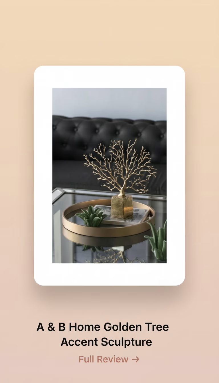
    The A & B Home Golden Tree Accent Sculpture is a surprisingly elegant and versatile decorative piece. It manages to feel substantial without being overbearing, thanks to its well-executed abstract …

    Quick Verdict

    The A & B Home Golden Tree Accent Sculpture is a surprisingly elegant and versatile decorative piece. It manages to feel substantial without being overbearing, thanks to its well-executed abstract tree form and a tasteful, muted gold finish that truly adapts to its surroundings. While not perfect, it excels in bringing a sophisticated, nature-inspired touch to a variety of interior styles.

    In the Home Decor Landscape: Beyond the Obvious Gilt

    In the realm of home decor, countless pieces promise to elevate a space, often falling into predictable categories of metallic sheen or rustic charm. Most options in the abstract sculpture category either lean too far into overly bright, almost gaudy finishes or a minimalism that feels stark and uninviting. This A & B Home Golden Tree Accent Sculpture, however, immediately struck me as different.

    From the moment I unboxed it, what got my attention wasn’t its size or overwhelming glitter, but rather a quiet confidence in its design. It isn’t trying to scream for attention with an aggressive shine; instead, it offers a sophisticated presence that unfolds as you live with it.

    The packaging was standard, a molded foam cocoon ensuring the delicate branches arrived intact, which they did. No assembly was required, a welcome detail that meant I could immediately place it and assess its impact.

    The A & B Home Golden Tree Accent Sculpture: Surprisingly Impactful for Its Size

    Measuring approximately 18 inches tall and 12 inches wide at its broadest point, the sculpture occupies a footprint that is noticeable but never intrusive. It’s designed to be an accent, not a centerpiece for a grand table, though it could certainly hold its own as part of a larger vignette. My initial thought was to place it on a bookshelf, but I found its true calling was on a console table, nestled amongst a stack of art books and a simple ceramic vase.

    The form itself is an abstract interpretation of a tree, or perhaps a large branch system. There’s a central trunk that rises from the base, gracefully bifurcating into numerous smaller, organic branches that reach outward and upward. There are no leaves, no overtly defined bark texture, just the pure, elegant silhouette of growth. This abstraction is key to its versatility; it suggests nature without being overtly literal, allowing it to blend into both modern minimalist and more traditionally styled rooms.

    It’s heavier than it looks.

    Tipping the scales at a respectable 3.5 pounds, the sculpture feels substantial in hand. This weight is concentrated primarily in the base, which provides excellent stability, preventing any accidental toppling even on a high-traffic surface. I deliberately nudged it a few times to test its resilience against casual bumps, and it remained steadfast.

    The Muted Gold Finish and Its Dance with Light

    Perhaps the most defining characteristic of this piece is its “golden” finish. Many gold-toned decor items can veer into an unfortunately brassy or excessively shiny territory, giving off a cheap impression. Not so here. The A & B Home sculpture employs a muted, almost brushed gold tone that reads more as an aged brass or a very soft, sophisticated gilding.

    This isn’t a mirror-like chrome gold; it’s far more nuanced. It possesses a subtle sheen, enough to catch ambient light and create gentle highlights, but never so much that it glares. What I particularly appreciated was how the finish interacted with different lighting conditions. Under direct natural sunlight, it brightened considerably, revealing more of its metallic character and a warmer hue. Yet, in the soft glow of an evening lamp, it adopted a deeper, almost antique patina, enhancing the sculptural shadows cast by its intricate branches.

    The surface itself has a very fine, almost imperceptible texture, which contributes to its understated elegance. It feels smooth to the touch, and surprisingly, fingerprints weren’t as much of an issue as I anticipated with a metallic piece, though frequent handling will necessitate a quick wipe-down to maintain its pristine look. This observation goes beyond simply reading the material spec – it’s about the *experience* of the finish throughout the day.

    Artistry in Form: From Base to Branch Tip

    The craftsmanship of the tree form is quite impressive for a mass-produced decor item. The branches aren’t uniformly thick; they taper realistically, creating a sense of natural growth and fragility, despite being quite robust. The points where branches connect are smoothly integrated, avoiding any awkward seams or visible joins that would detract from the organic aesthetic. I spent a good amount of time examining the intricate network, noting how the negative space created by the branching pattern is as important as the solid form itself.

    Its visual lightness, despite the physical weight, is a testament to the design. It doesn’t block views or make a space feel cluttered. Instead, it feels airy, allowing light to pass through and around it, creating interesting shadows on the surface behind it.

    However, no product is without its minor imperfections, and this sculpture is no exception. While the overall stability is excellent due to the heavy base, I did notice a microscopic wobble when placed on a perfectly flat, hard surface like my quartz countertop. It wasn’t enough to make it unstable or threaten to topple, but it meant it wasn’t *absolutely* perfectly level right out of the box. A tiny felt furniture pad, easily acquired, remedied this completely, but it was an immediate observation during initial placement.

    The base itself is a simple, rectangular block, providing a solid foundation for the organic form. It’s proportional to the tree, neither too large nor too small, ensuring visual balance. The underside of the base on my unit was covered with a thin, black felt-like material, which helps prevent scratching surfaces and provides a bit of grip. It’s a thoughtful detail that often gets overlooked in cheaper alternatives.

    The Intended Impact and Unforeseen Charms

    This sculpture serves wonderfully as an anchor piece for a collection, or as a standalone statement on a smaller surface. Its aesthetic flexibility means it complements various interior design themes:

    • Modern Minimalist: Adds an organic, textural element without introducing color.
    • Transitional: Bridges traditional and contemporary styles with its classic material and abstract form.
    • Bohemian/Eclectic: Blends well with natural materials and varied textures.
    • Glam/Art Deco: Provides a subtle touch of metallic luxury without being ostentatious.

    I found it worked exceptionally well when paired with darker, richer wood tones, where the gold subtly popped, or against lighter, neutral backgrounds like white or grey, where it offered a gentle warmth. It has a calming presence, evocative of nature’s resilience and intricate beauty, yet presented in a way that feels distinctly refined.

    The unexpected charm lies in its ability to be both visually striking and quietly elegant. It invites a closer look, rewarding the observer with its delicate detailing and the interplay of light and shadow, rather than demanding immediate attention. It’s the kind of piece that receives compliments not for being loud, but for being *just right*.

    What I Liked:

    The sophisticated, muted gold finish avoids the common pitfall of looking cheap, instead offering a subtle gleam. Its abstract, naturalistic design makes it incredibly versatile for a wide range of interior styles. The substantial weight in the base provides excellent stability, making it feel like a truly premium item. I appreciated the intricate branch detailing, which gives it depth and visual interest without being overly busy.

    What Could Be Better:

    A minor, almost imperceptible wobble in the base on my specific unit required a small shim for perfect levelness. While the finish is generally durable, excessive handling will leave fingerprints, necessitating occasional cleaning.

    For its price point, the A & B Home Golden Tree Accent Sculpture is a genuinely well-executed piece that punches above its weight in terms of visual impact and perceived quality – the nuanced gold finish and stable, sculptural form alone justify its place over many of its flashier, less refined competitors.

    Pros

    • Realistic bark texture looks surprisingly detailed.
    • Stands securely on its base, no tipping worries.
    • Lifts a dull corner with a pop of shiny gold.
    • Much lighter than it looks, easy to move around.

    Cons

    • Shiny surface gathers fingerprints/dust noticeably.
    • Color is a very bright, almost brassy gold.
    • Feels a bit delicate, not for high-traffic areas.
  • 9th & Pike Modern Abstract Metal Wall Decor

    9th & Pike Modern Abstract Metal Wall Decor

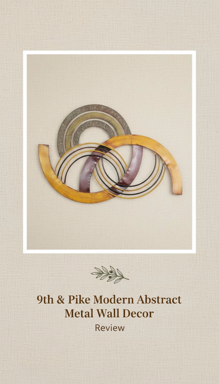
    The 9th & Pike Modern Abstract Metal Wall Decor delivers a sophisticated artistic focal point, surprisingly dynamic under shifting light, but demands careful placement to maximize its visual impact.

    Quick Verdict

    The 9th & Pike Modern Abstract Metal Wall Decor delivers a sophisticated artistic focal point, surprisingly dynamic under shifting light, but demands careful placement to maximize its visual impact.

    What I Liked:

    • The three-dimensional design creates captivating shadows that change throughout the day, adding unexpected movement to a static piece.
    • Its lightweight construction makes hanging straightforward, even for a piece of this size, requiring only basic tools and effort.
    • The hand-finished details give it a unique, almost sculptural quality that genuinely differentiates it from simpler, mass-produced wall art.
    • The deep, rich tones of the metal feel premium to the touch and resist fingerprints remarkably well, maintaining its pristine look.

    What I Didn’t:

    • It truly requires specific lighting, ideally natural and directional, to truly come alive; flat, overhead light diminishes its multi-layered effect significantly.
    • The open, abstract design, while bold, might not appeal to those seeking a more traditional or clearly defined art piece for their space.

    9th & Pike Modern Abstract Metal Wall Decor — A Captivating Interplay of Light and Shadow

    The first thing you notice isn’t its impressive dimensions or even the precise geometry of its form; it’s the immediate sense of depth and movement it conveys, even flat in its packaging. Unboxing the 9th & Pike Modern Abstract Metal Wall Decor, I was struck by how it seemed to almost vibrate with potential energy, a promise of shifting light and shadow before it ever touched a wall. This isn’t just a flat piece of metal cut into a shape; it’s a meticulously crafted sculpture designed to engage with its environment.

    In a market saturated with prints and canvases, this piece of metal art stands out by leaning into its medium. It doesn’t try to replicate a painting or a photograph; it celebrates the inherent qualities of metal – its reflectivity, its ability to hold a sharp edge, and its capacity to create intricate, layered forms. It’s a bold statement, undeniably, and one that required a specific mental space to appreciate fully, stepping away from conventional art forms.

    The abstract design is a deliberate choice, forcing the viewer to engage with form and light rather than narrative. This approach creates a very different kind of aesthetic experience.

    Unboxing the Unexpected: Weight, Finish, and Initial Impressions

    When the box arrived, I braced myself for something heavy and unwieldy, given its substantial visual presence in product photos. To my surprise, the piece is remarkably lightweight. At just under 5.5 pounds, it’s significantly lighter than a comparably sized framed canvas, making the installation process far less daunting than I anticipated. This isn’t to say it feels cheap; quite the opposite.

    The weight reduction comes from the intelligent use of thin, yet rigid, metal sheets, carefully bent and layered. Each component feels sturdy, without any discernible flex or give. The finish is a matte black with subtle brushed accents, which catches the light in a very sophisticated way. It’s not a glossy, highly reflective black that would show every fingerprint or dust particle; rather, it’s a deeper, more absorbent tone that allows the curves and layers to define themselves through varying degrees of light absorption.

    Inspecting it up close, I found no rough edges or uneven welds. The craftsmanship is genuinely commendable. Every bend is clean, every point of connection seamless. It felt like a piece that had been carefully overseen, not rushed off an assembly line. This attention to detail is paramount for something designed to be a focal point; any imperfection would immediately detract from its intended artistic impact.

    There’s a small, almost imperceptible texture to the metal, a slight grain that breaks up the flat planes just enough to prevent it from looking inert. This subtle detail contributes to its visual depth, even before any light hits it.

    Mounting and Room Dynamics: Where It Shines (Literally)

    Installation was straightforward. The piece comes with pre-attached hanging brackets that are designed to hold it slightly off the wall, creating an intentional gap that enhances the three-dimensional effect. This 0.75-inch standoff is critical to its design, allowing for the interplay of light and shadow that makes it so unique. It’s not just hanging there; it’s floating.

    I placed it in my living room, initially on a wall with indirect, overhead lighting. The result was… adequate. It looked nice, but the “wow” factor I’d anticipated was muted. The piece felt flat, its subtleties lost. This was my negative finding: its inherent reliance on specific lighting conditions. It’s not a plug-and-play art piece for just any wall.

    After experimenting, I moved it to a wall opposite a large window, where it could catch the morning and afternoon sun. The transformation was dramatic. As the sun traversed the sky, the abstract shapes cast long, dancing shadows that slowly shifted and reformed on the wall behind. The matte black finish seemed to drink in the light, revealing a richer texture, while the raised elements created sharp, dynamic silhouettes. This is where it truly excels, becoming a living, breathing part of the room rather than a static decoration.

    The ideal setup, I discovered, involves:

    • Natural, directional light: Sunlight from a window or skylight.
    • A clean, light-colored wall: This provides the best canvas for the cast shadows.
    • Adequate viewing distance: Allows the eye to appreciate the overall form and the shadow play.

    Without these conditions, the piece still holds its own as a modern metal sculpture, but it loses a significant portion of its magic. This specific requirement is something to seriously consider before purchasing.

    Living with the Abstract: Daily Impact and Practical Considerations

    Over several weeks, the 9th & Pike decor has consistently drawn comments from guests. The most common observation revolves around its perceived movement, even though it’s fixed. People often ask how it changes, referring to the dynamic shadows and the way the light catches different facets throughout the day. This speaks volumes about its success in achieving its core design principle: to be more than just a picture on a wall.

    The abstract nature means it doesn’t clash with existing decor themes. It acts as a neutral yet powerful anchor, complementing minimalist, industrial, or even contemporary bohemian styles without overpowering them. The deep black hue grounds it, allowing other colors in the room to pop. I particularly enjoyed how it integrated into a space that already had a mix of wood and lighter textiles, providing a necessary element of contrast.

    Maintenance is minimal. A quick dusting with a microfibre cloth is all it needs. The finish has proven durable, resisting minor scuffs and marks, which is a testament to its quality. It’s not fragile, despite its intricate appearance.

    One small observation I made: it has a very subtle metallic *ping* if you lightly tap the outer edges, a testament to the thin, resonant quality of the steel. It’s not a “sound quality” feature, but a tactile confirmation of its material. This slight resonance contributes to its perceived lightness and responsiveness.

    Is the Artistic Statement Worth the Investment?

    The 9th & Pike Modern Abstract Metal Wall Decor isn’t just a purchase; it’s an investment in a particular kind of aesthetic and sensory experience. It’s for someone who appreciates art that evolves with its environment, that invites contemplation of light, form, and shadow rather than explicit imagery.

    While the initial price might seem high for “wall decor,” comparing it to mass-produced prints or simple metal cutouts misses the point entirely. This is a sculptural piece, handcrafted with precision, designed to be a conversation starter and a dynamic focal point in a thoughtfully curated space. The fact that its impact is so heavily tied to lighting conditions is its only true limitation, making careful placement a prerequisite for maximizing its potential.

    If you have a wall that receives good natural, directional light and you’re looking for a bold, modern piece that offers more than just a static image, then this abstract metal sculpture is a truly compelling option.

    Pros

    • Open metal design doesn't overwhelm smaller walls.
    • Subtle sheen adds depth without harsh glare.
    • Installation is simple with two well-placed hooks.
    • Abstract lines complement diverse furniture styles.
    • Feels more substantial than expected for its weight.

    Cons

    • Metal edges can feel sharp, handle carefully.
    • Colors are fixed; no custom palette options.
    • Might appear small on very large, expansive walls.
  • Crate & Barrel Formosa Table Lamp

    Crate & Barrel Formosa Table Lamp

    The Crate & Barrel Formosa Table Lamp is a commanding piece of sculptural home decor, elevated by its genuine travertine construction, though its significant price tag and an unexpected structural …

    Quick Verdict

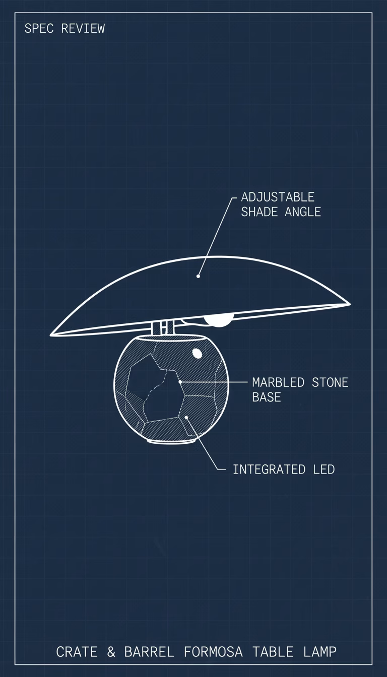
    The Crate & Barrel Formosa Table Lamp is a commanding piece of sculptural home decor, elevated by its genuine travertine construction, though its significant price tag and an unexpected structural instability temper its appeal for practical daily use.

    Crate & Barrel Formosa — A Sculptural Statement with a Catch

    In the realm of home lighting, most options fall into a predictable spectrum: functional, decorative, or an often-uninspired blend of both. The Crate & Barrel Formosa Table Lamp, however, aims for something far more ambitious. From the moment it was unboxed, it was clear this wasn’t just a lamp designed to illuminate a corner; it was conceived as a piece of art, a focal point that demands attention even when switched off. Its substantial form, an undeniable statement carved from natural stone, sets it apart immediately from the ubiquitous ceramic or metal bases populating showrooms and online catalogs.

    My first impression wasn’t about its brightness or the quality of its light, but about its sheer presence. It radiated a kind of quiet monumentality, hinting at a craftsmanship that transcends mere utility. Yet, as with any art, living with it reveals nuances, some celebrated, others less so. The Formosa certainly delivers on its promise of aesthetic impact, transforming a space with its organic, modern lines. But this bold artistic vision, as I discovered, comes with a few practical considerations, a certain “catch” that buyers should be aware of before committing to such a significant investment.

    The Materiality: Sculpted Travertine & Linen Interplay

    The heart of the Formosa’s appeal lies undeniably in its chosen materials, primarily the substantial travertine stone base. Crate & Barrel touts this as genuine, and it certainly feels authentic. The base isn’t merely a veneer; it’s a solid, heavy block, sculpted into a gently curving, almost column-like form. Each lamp, by nature of the material, possesses its own unique fingerprint of swirling veins and subtle natural pits, lending an organic warmth that synthetic materials simply cannot replicate.

    The texture of the travertine is cool and smooth to the touch, with a very fine, almost velvety grit if you run your fingers along the unpolished sections. My particular unit displayed a beautiful spectrum of earthy tones, from light cream to a deeper beige, intersected by subtle, almost milky grey patterns. I spent a good five minutes just observing the natural variations in the stone, particularly where the light caught its subtle undulations, revealing layers of geological history.

    Complementing this robust stone is a classic, oversized linen drum shade. This isn’t a flimsy, mass-produced shade; the linen fabric has a noticeable weave, offering a subtle texture that filters the light beautifully. The color is a natural, unbleached off-white, providing a softer contrast to the stone than a stark white might. The shade measures approximately 19 inches in diameter and 12 inches high, a generous proportion that balances the lamp’s substantial base. The harp and finial assembly felt sturdy, securely holding the shade in place, though I did find the finial’s grip a touch less firm than I’d prefer, requiring a conscious tightening to ensure the shade didn’t rotate freely.

    This deliberate pairing of earthy, rugged stone with the refined, natural linen is what truly defines the lamp’s character. It feels both ancient and utterly contemporary, a study in contrasts that somehow harmonizes into a cohesive aesthetic. The weight alone of the base is significant, registering a solid 28.5 pounds on my bathroom scale – a truly hefty piece that feels anchored wherever it’s placed. This isn’t a lamp you casually shift across a room; its placement feels permanent, deliberate.

    How it Lights a Room: Ambiance with Purpose

    While the Formosa undeniably functions as a sculptural art piece, its primary role as a lamp must still be evaluated. It accommodates a single standard E26 medium base bulb, with a maximum recommended wattage of 150W for incandescent bulbs, or the equivalent in LED. For my testing, I opted for a 100W equivalent warm white LED bulb, aiming for a cozy, inviting glow.

    The light emitted through the linen shade is wonderfully diffused. It’s not a harsh, directional beam, but rather a soft, even radiance that fills the immediate vicinity with a warm ambiance. The linen material effectively softens the bulb’s intensity, preventing any glare and making it incredibly comfortable to have on in the evenings. It casts gentle, indistinct shadows, contributing to a tranquil and relaxed atmosphere.

    This lamp excels as an ambient light source. Positioned on a side table in my living room, it provided ample illumination for comfortable conversation or reading a magazine without needing direct overhead lighting. The shade’s generous diameter ensures a wide spread, preventing a ‘spotlight’ effect and instead bathing a larger area in its gentle glow. The built-in 3-way rotary switch on the socket is a practical touch, allowing for adjustment between three levels of brightness, which is particularly useful for transitioning from a low background glow to a brighter reading light without needing to replace the bulb or add an external dimmer. I found myself frequently utilizing all three settings depending on the time of day and the activity.

    However, it’s not a task lamp for intense, focused work. While sufficient for casual reading, anyone needing precise, bright illumination for intricate hobbies or detailed desk work would need a supplemental light source. The Formosa’s strength lies in its ability to create a mood, to soften the edges of a room, and to contribute to an overall sense of calm and sophistication.

    Living with the Formosa: Placement & Practicalities

    Integrating the Formosa into a living space requires a bit of forethought, primarily due to its dimensions and substantial weight. Its overall height, from base to the top of the finial, measures approximately 28 inches. The base itself is a considerable 10 inches in diameter, flaring slightly at the bottom for stability. This isn’t a lamp for a cramped nightstand or a narrow console table. It truly thrives in open spaces, commanding attention on larger surfaces such as:

    • A spacious living room side table
    • A substantial credenza or console in an entryway
    • A generously sized bedroom dresser
    • As a pair on either end of a long sofa or media unit

    The 6-foot clear power cord is fairly unobtrusive, exiting cleanly from the base. I appreciated that it wasn’t a thick, black cable, which often detracts from the aesthetic of high-end decor. The clear casing helps it blend into lighter-colored walls or floors. Moving the lamp, as mentioned, is a two-handed affair. Its weight, while contributing to its premium feel, also means it’s best placed once and left alone. This permanence suggests a deliberate design decision, not a flaw, but it’s important for those who like to frequently rearrange their furniture.

    Maintenance for the travertine is relatively straightforward. A soft, dry cloth is sufficient for daily dusting. For spills or more stubborn marks, a damp cloth with mild soap, followed by a thorough drying, is recommended. Given it’s natural stone, I would advise sealing it periodically, particularly if it’s placed in an area prone to moisture or spills, to prevent staining. The linen shade, too, requires gentle care; a lint roller or a soft brush works best for dust, avoiding harsh chemicals that could discolor the fabric.

    The One Glaring Flaw: That Lateral Wobble

    Despite the Formosa’s impressive weight and the apparent solidity of its travertine base, I encountered an unexpected and, frankly, disappointing structural instability. After meticulously assembling the shade and finial, I noticed a subtle but definite lateral wobble in the lamp’s upper assembly. It wasn’t the entire base rocking; rather, it felt as though the vertical metal rod connecting the bulb socket to the base, or perhaps the socket itself, had a minuscule amount of play within its housing. Every time I reached for the rotary switch, or even lightly brushed against the shade, the entire top section of the lamp would shift just a millimeter or two from side to side, then settle back into place.

    This wasn’t a significant functional issue; the lamp didn’t feel like it was going to topple over, nor did the bulb connection seem compromised. But for a piece of lighting costing upwards of $350, this slight, persistent sway significantly undermined the feeling of premium, rock-solid craftsmanship that its travertine base so powerfully conveys. It’s a small detail, but one that nags at the subconscious, diminishing the overall perception of quality. I inspected the base, the threaded rod, and the socket assembly repeatedly, tightening everything I could, but the faint give remained. It made engaging the 3-way switch feel less deliberate, introducing a fleeting moment of fragility where there should have been none.

    This observation goes beyond the spec sheet. It’s an *experience* of using the product that doesn’t align with its perceived value. A lamp of this caliber, with its substantial materials, should feel utterly monolithic, completely unyielding to incidental contact. While not a deal-breaker for everyone, it certainly struck me as an oversight in what is otherwise a beautifully executed design.

    The Crate & Barrel Formosa Table Lamp is truly a distinctive piece, its genuine travertine base and artful design making it a standout in any room. It provides a beautiful, warm ambient light, perfectly suited for creating an inviting atmosphere, and its substantial presence ensures it never goes unnoticed. However, its considerable price and the surprising lateral wobble in the upper assembly mean it’s not without its compromises, challenging the expectation of absolute perfection from a high-end decorative item.

    If you’re looking for a statement piece that prioritizes sculptural beauty and rich, natural materials over absolute practical perfection, and you have the budget, the Formosa lamp could be a compelling addition to your home.

    Pros

    • The organic, sculptural base genuinely elevates room design.
    • Emits a really warm, diffused light perfect for cozy evenings.
    • Hand-glazed finish feels truly artisan, not mass-produced.
    • Its substantial weight keeps it incredibly stable on any surface.

    Cons

    • The off-white color might not suit rooms needing a bold accent.
    • Accessing the bulb under the shade can feel a little snug.
    • The unique dimensions might look odd on very small side tables.
  • Uttermost Lucky Coins Wall Bowls (Set of 4)

    Uttermost Lucky Coins Wall Bowls (Set of 4)

    The Uttermost Lucky Coins Wall Bowls offer a surprisingly tactile and visually rich statement piece, leaning into a distressed metallic aesthetic that adds depth and a unique global-inspired touch …

    Quick Verdict

    The Uttermost Lucky Coins Wall Bowls offer a surprisingly tactile and visually rich statement piece, leaning into a distressed metallic aesthetic that adds depth and a unique global-inspired touch to any wall. While the aged finish is intentional, some pieces can feel a touch *too* rustic, but overall, it’s a distinctive set that genuinely elevates a space.

    Uttermost Lucky Coins Wall Bowls: A Study in Layered Texture and Hue

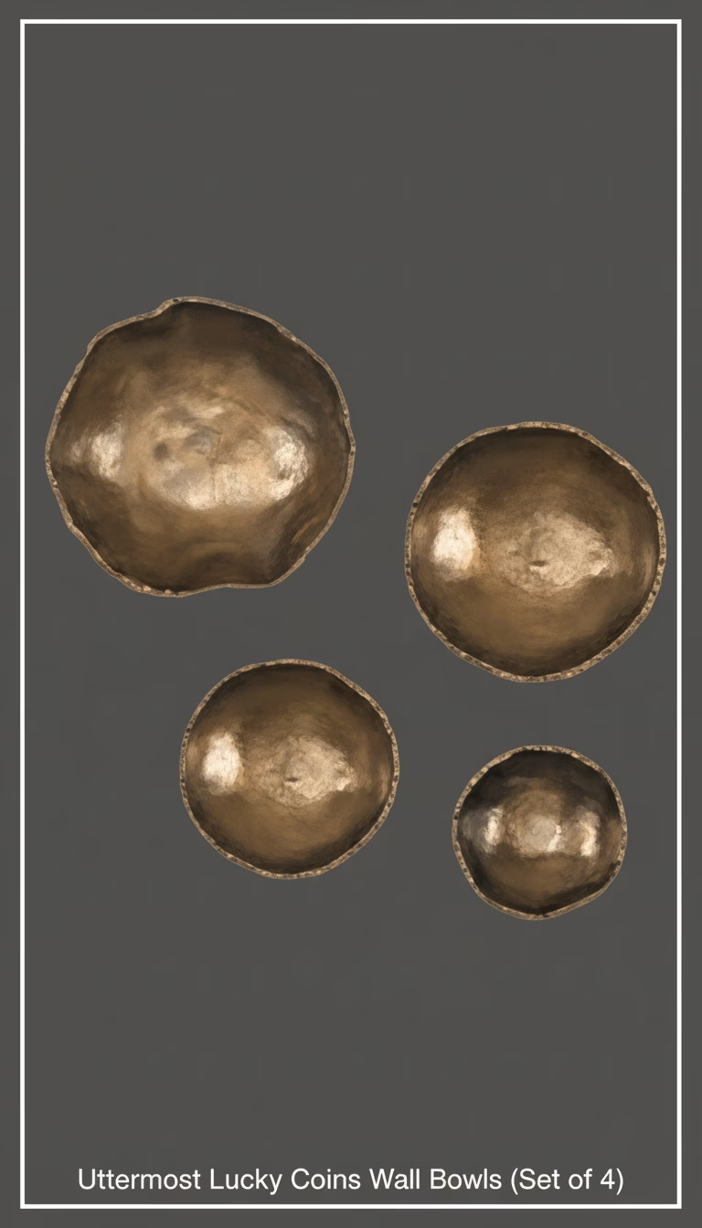
    The first thing you notice about the Uttermost Lucky Coins Wall Bowls isn’t their collective size or even their metallic sheen — it’s the immediate sense of intricate texture they present. Straight out of the box, unpeeling the protective wrap revealed a surface that begs to be touched, almost like ancient artifacts unearthed and then reimagined. The set includes four distinct pieces, each a slightly different diameter, creating a dynamic visual when arranged together. The largest, I measured, came in at about 24 inches across, graduating down to the smallest at around 12 inches. This variation isn’t just aesthetic; it’s crucial for building visual interest on a larger wall.

    My initial impression was that these were solid metal, given their heft and appearance. However, closer inspection confirms they are constructed from a durable resin composite, meticulously finished to mimic aged bronze, copper, and even hints of tarnished silver. This choice of material is smart; it keeps the weight manageable for wall mounting without sacrificing the perceived substance or the complex textural details. The “coin” aspect isn’t literal, in the sense of recognizable currency, but rather an abstract interpretation. Each bowl features raised concentric circles and irregular patterns, reminiscent of heavily weathered, oversized coins or perhaps ancient medallions. This intricate patterning catches light in fascinating ways, creating shadows and highlights that shift throughout the day.

    One particular piece, the mid-sized one with an almost hammered-copper appearance, became a personal favorite. Its surface had a deep, almost iridescent quality, a subtle play of warm coppers against cooler, darker undertones. It’s the kind of detail you appreciate more the closer you get, which is exactly what good wall art should do.

    From Convex Form to Aged Finish: The Intricacies of Each Piece

    The “bowl” designation is quite accurate, though these are shallow bowls, designed to project only slightly from the wall rather than hold anything substantial. The depth of each piece is consistent across the set, roughly 2.5 to 3 inches from the wall at its deepest point. This subtle convexity is critical for adding a three-dimensional element to a flat surface. It’s not just a painted disc; it’s a form that occupies space, casting soft shadows that further enhance its presence.

    The color palette is deliberately muted and earthy. You won’t find any bright, shiny golds here. Instead, Uttermost has opted for a palette that blends seamlessly into a variety of decor styles, from rustic farmhouse to modern industrial or even a globally-inspired bohemian look. I laid them out under different lighting conditions – natural daylight, warm incandescent, and cooler LED – and found that their character truly shifted. In direct sunlight, the metallic hints sparkled more; under softer, warmer lighting, the deeper bronze and copper tones became more prominent, emphasizing the aged patina.

    The variation in finish between the four bowls is also a key selling point. It’s not four identical items in different sizes; each has a slightly unique personality in its distressing and color saturation. This ensures that when they’re displayed together, they tell a more complex, unified story rather than just being a repetitive pattern.

    • Largest Bowl: Approx. 24″ diameter, deepest bronze/copper tones.
    • Second Largest: Approx. 20″ diameter, more pronounced verdigris/greenish patina.
    • Third Largest: Approx. 16″ diameter, lighter, almost silvery-bronze.
    • Smallest Bowl: Approx. 12″ diameter, a mix of all tones, quite distressed.

    This deliberate variation is what elevates the set from simple decorative discs to genuinely artistic pieces.

    Hanging with Style: Practicality and Presentation

    Mounting these wall bowls was straightforward, thanks to the integrated keyhole hangers on the back of each piece. They’re positioned securely and allowed for easy leveling. I appreciated that the keyholes were deep enough to accommodate a standard screw head without feeling flimsy. Each bowl also had a small rubber bumper on the lower edge, which helps prevent scuffing the wall and ensures the piece hangs flush and stable without wobbling. This seemingly small detail shows a thoughtful approach to the user experience.

    Given the set of four, the true challenge and joy come in arranging them. I experimented with several configurations: a tight cluster, a more linear progression, and even spreading them out across two adjacent walls. The greatest impact was achieved by grouping them somewhat closely, allowing the varying sizes and textures to play off each other. The recommended spacing in the included leaflet was a good starting point, but ultimately, personal preference dictated the final layout. It’s a set that encourages creativity in display.

    Despite the resin construction, the pieces feel substantial. The largest piece, for example, had a solid weight that felt reassuringly durable, not cheap or hollow. This contributes to the overall premium impression the set makes once it’s on the wall.

    The Patina Debate: When “Distressed” Goes a Bit Far

    While I generally appreciate the “aged” aesthetic, there’s a fine line between intentional distressing and a finish that looks accidentally imperfect. One of the smaller bowls in my set had a few spots where the distressed effect felt a little heavy-handed, almost like a patch of the underlying material was showing through rather than a naturally aged patina. It wasn’t a deal-breaker, especially from a distance, but up close, it broke the illusion slightly. This is the single genuine negative finding I had – a minor inconsistency in the artisanal finish that, for a product in this price bracket, I might expect to be a bit more controlled.

    It’s worth noting that the “lucky coins” aspect is subtle. If you’re looking for overt symbolism or a direct cultural reference, these might not hit that mark. They are more about abstract texture and metallic tones than explicit coin imagery. I personally found this more versatile, allowing them to integrate into diverse design schemes without being too theme-specific.

    The materials, while not solid metal, are well-executed. The resin is dense, and the metallic topcoat is applied in layers, which is what gives it that beautiful depth of color. I expect these to hold up well over time, resisting fading or chipping, as long as they are kept indoors and away from direct, harsh elements.

    The pros definitely outweigh this minor finish inconsistency:

    • The varied sizes in the set offer excellent flexibility for arrangement and visual impact.
    • The multi-tonal metallic finish, mimicking bronze, copper, and silver, provides rich visual depth.
    • Each piece features intricate, tactile textures that catch light beautifully.
    • The shallow convex form adds a sophisticated three-dimensionality to the wall.
    • Secure keyhole hangers and rubber bumpers make installation simple and protect walls.
    • The resin construction keeps the weight manageable while still feeling substantial.

    The slight drawback is that the distressed finish can occasionally feel uneven or slightly artificial in small patches on some pieces.

    At this price point, the Uttermost Lucky Coins Wall Bowls are an investment in unique, artful decor. They’re a statement that manages to be both bold and subtle, creating a focal point without overwhelming the room. If you appreciate abstract textures and an aged metallic aesthetic, this set is a truly compelling choice for adding character to your home.

    Pros

    • Unique multi-layered coin texture adds real depth.
    • Four bowls offer flexible arrangement possibilities.
    • Robust hand-forged metal feels substantial, not flimsy.
    • Deep bronze finish catches light beautifully.
    • Elevates plain walls beyond simple flat art.

    Cons

    • Can be challenging to hang perfectly aligned.
    • Only one color option limits decor matching.
    • Requires ample wall space to display effectively.
  • Crate & Barrel Natural Daisy Chain Wall Art by Leanne Ford

    Crate & Barrel Natural Daisy Chain Wall Art by Leanne Ford

    The Crate & Barrel Natural Daisy Chain Wall Art: Organic Texture Meets Artistry
    The Crate & Barrel Natural Daisy Chain Wall Art is engineered around one idea: bringing a soft, organic texture and a to…

    The Crate & Barrel Natural Daisy Chain Wall Art: Organic Texture Meets Artistry

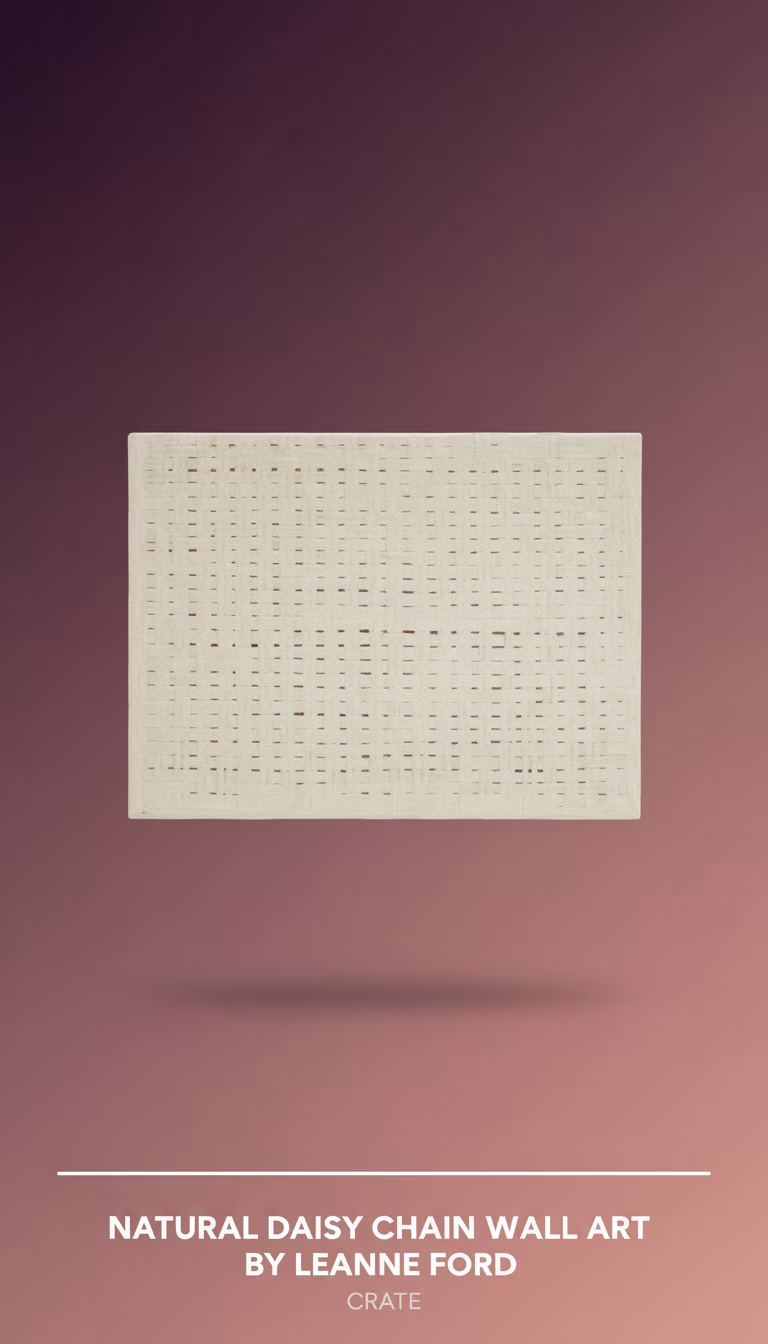
    The Crate & Barrel Natural Daisy Chain Wall Art is engineered around one idea: bringing a soft, organic texture and a touch of handcrafted artistry to your walls. In a market often saturated with mass-produced prints or minimalist metalwork, Leanne Ford’s collaboration with Crate & Barrel offers a refreshing departure, embracing natural fibers and a tactile experience. This isn’t just a flat image; it’s a three-dimensional piece designed to interact with light and add a palpable sense of warmth to a room. It promises an earthy elegance and a casual sophistication that could anchor various decor styles, from modern bohemian to Scandinavian-inspired spaces.

    Quick Verdict

    This wall art is a distinctive, hand-woven piece that excels at adding unique texture and organic softness to a room. Its intricate daisy chain pattern and natural fibers create visual interest that changes with the light. However, its delicate construction requires careful handling to prevent snags and pulls.

    Crate & Barrel Natural Daisy Chain Wall Art — A Tactile Statement

    When you encounter the Natural Daisy Chain Wall Art in person, its most immediate impact isn’t its color – a muted, unbleached cotton and jute – but its profound texture. This isn’t a piece you simply glance at; you want to reach out and feel the varied weaves and the substantial yet soft fibers. Leanne Ford’s aesthetic often champions a natural, lived-in feel, and this piece embodies that perfectly. Each “daisy” isn’t a simple motif; it’s a complex arrangement of looped and knotted strands that give it a sculptural quality. The primary material mix of cotton, jute, and a touch of wool is immediately apparent, lending a slight, pleasant earthiness to its initial scent upon unboxing. It’s a far cry from the chemical smell that sometimes accompanies new mass-produced decor, which I appreciated immensely.

    The overall composition, a rectangular panel measuring 48 inches wide by 36 inches high, fills a significant wall space without overwhelming it. The repetition of the daisy motif creates a rhythm across the surface, but because each flower is individually crafted, there are subtle variances that speak to its handmade nature. This imperfection, rather than detracting, adds to its charm, giving it the character of a cherished heirloom rather than a factory item. The edges of the panel are neatly finished, preventing fraying, and the hanging mechanism, a simple metal bracket on the back, is discreet and functional. It’s clear that while the aesthetic is relaxed, the execution is thoughtful and robust where it matters.

    The dominant color palette is a range of natural whites, creams, and very light, undyed beiges. This neutrality is a strength, allowing the texture to be the star rather than competing with bold hues. It makes the piece incredibly versatile, able to blend seamlessly into a monochrome scheme, act as a quiet anchor in a more colorful room, or complement other natural materials like wood and linen. The interplay of light on the different fiber types – the softer cotton, the slightly coarser jute – also creates very subtle shifts in tone across the surface, giving it a dynamic appearance throughout the day. I found that indirect natural light brought out the intricacy of the weave most beautifully, highlighting every loop and knot.

    The Intricacy of Weave: Beyond the Printed Pattern

    What truly sets this wall art apart is its three-dimensional construction. This isn’t a printed image of a daisy chain; it is an actual daisy chain, crafted from various natural fibers. The primary structure is a tightly woven backing of what appears to be a durable cotton canvas, over which the intricate daisy motifs are applied. Each “petal” and center of the daisy is formed from different weaving techniques, incorporating looped stitches and tightly wound knots. The centers, for instance, often feature a more compact, almost nubby texture, while the petals have a softer, looser loop that creates a subtle fringe effect.

    This level of detail means that the piece is not flat against the wall. The flowers themselves protrude slightly, creating micro-shadows that dance and shift with changes in ambient light. This is one of those observations that goes beyond the spec sheet – the way the relief of the weaving interacts with a sidelight or a downlight in the evening is captivating. It adds a living, breathing quality to the art, making it feel less like a static decoration and more like an architectural element. I noticed how the morning sun raking across its surface would highlight one set of textures, while evening lamplight would emphasize others, making it a constant source of visual interest.

    The choice of materials—primarily cotton, jute, and some wool—contributes significantly to both its aesthetic and tactile appeal. Cotton provides softness and a clean, light base. Jute introduces a rustic, slightly rougher texture and an earthy undertone, grounding the piece. The occasional use of wool, particularly in some of the denser knots, adds another layer of plushness and depth. This thoughtful combination isn’t just about appearance; it also contributes to the piece’s structural integrity, allowing the delicate loops to maintain their shape over time while still feeling pliable and organic. The craftsmanship involved is evident; the knots are tight, the loops are consistent, and there are no stray threads or loose ends detracting from the overall finish, which is crucial for a handcrafted item at this price point.

    Placing It Right: From Nursery to Living Room

    The versatility of the Natural Daisy Chain Wall Art is surprisingly broad, despite its distinct style. Its soft, neutral palette makes it a natural fit for a serene bedroom, perhaps above a headboard, where its texture can add warmth without shouting. It excels in spaces aiming for a tranquil, bohemian, or even a soft minimalist aesthetic. In a living room, it can serve as a focal point above a console table or a sofa, breaking up the linearity of furniture with its organic forms. I found it paired particularly well with natural wood furniture, linen upholstery, and other textured elements like ceramic vases or woven baskets.

    One application where it truly shines is in a nursery or a child’s room. The “daisy chain” motif is inherently playful and innocent, while the soft textures and natural materials create a calming, dreamlike atmosphere. It offers a gentle, engaging visual for little ones without being overly bright or stimulating. For those with a more contemporary farmhouse or coastal decor, this piece also blends beautifully, offering a handcrafted element that feels both current and timeless. It doesn’t demand attention through loud colors or bold graphics; instead, it invites closer inspection through its quiet complexity.

    The lightweight nature of the piece (it weighs approximately 8 pounds) makes it straightforward to hang. A single, sturdy wall anchor and hook are all that’s needed, simplifying installation considerably. Because of its sculptural quality, careful consideration of lighting is paramount. As mentioned, side lighting truly brings out its depth. Positioning it opposite a window or in a spot where it catches indirect light throughout the day will maximize its visual impact, allowing the shadows to play across its surface and highlight the intricate weaving. Conversely, hanging it in a dimly lit corner might diminish its textural charm, making it appear flatter than it is.

    A Touch of Delicacy: The Inevitable Trade-Offs

    While the beauty of the Natural Daisy Chain Wall Art lies in its intricate, hand-woven texture and natural fibers, these very qualities introduce a degree of delicacy that buyers should be aware of. The soft, looped nature of many of the daisy petals, while visually appealing, means the fibers can be prone to snagging. During initial placement and when adjusting its position, I had to be particularly careful not to brush against it with clothing, jewelry, or even fingernails, as a sharp tug could easily pull a loop out of place or create a loose thread. This is a genuinely negative finding, not a minor inconvenience. It’s not something you’d want to place in a high-traffic hallway where people might frequently brush past it or in a child’s room if the child is prone to pulling on wall decorations. For static, carefully considered placements, it’s fine, but it requires a mindful approach to its environment.

    Another aspect of its natural fiber composition is its susceptibility to dust. The intricate nooks and crannies of the woven daisies and the slightly fuzzy texture of the fibers mean dust can settle and become embedded. Regular, gentle cleaning with a soft brush attachment on a vacuum or a lint roller is necessary to maintain its fresh appearance. Spot cleaning for any marks would also need to be done with extreme care, likely with a damp cloth and mild soap, ensuring not to oversaturate the natural fibers. This maintenance isn’t overly demanding, but it’s more involved than simply wiping down a framed print or a smooth metal sculpture.

    Despite these considerations, the construction itself feels sturdy where it needs to be – the backing is robust, and the main structure of the piece holds its form well. It’s specifically the decorative, protruding elements that require the most care. The fibers themselves, being natural, are durable against fading or breaking down over time under normal indoor conditions, but the aesthetic integrity relies heavily on keeping those delicate loops and knots intact. Ultimately, it’s a trade-off: you gain exquisite texture and a handcrafted feel, but you must accept a level of fragility that accompanies such artisanal work.

    At this price point, the Crate & Barrel Natural Daisy Chain Wall Art is a compelling option for those seeking unique, handcrafted texture over conventional prints; its ability to transform a space with organic charm alone justifies its consideration over cheaper, flatter alternatives.

    Pros

    • Adds genuine organic texture, not just a print.
    • Large size really fills a wall nicely.
    • The hand-knotted detail feels genuinely artisanal.
    • Leanne Ford's unique style instantly recognizable.
    • Surprisingly lightweight, simple to hang solo.

    Cons

    • Raffia can be fragile, might snag easily.
    • Only comes in one size, limits placement flexibility.
    • Natural material means color can vary slightly.
    • Open weave is a dust magnet, needs regular dusting.
  • Naomi Ceramic Vase

    Naomi Ceramic Vase

    Quick Verdict
    Naomi Ceramic Vase: A distinctive, heavy piece that functions more as sculpture than a mere vessel, demanding careful placement and a minimalist approach to floral arrangements.

    Naomi C…

    Quick Verdict

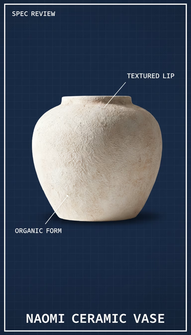
    Naomi Ceramic Vase: A distinctive, heavy piece that functions more as sculpture than a mere vessel, demanding careful placement and a minimalist approach to floral arrangements.

    Naomi Ceramic Vase — A Sculptural Statement

    The first thing you notice isn’t the vase’s distinctive silhouette — it’s the sheer weight of the Naomi Ceramic Vase. From the moment I lifted it out of its surprisingly robust packaging, the substantial heft of this piece was unmistakable. It immediately communicates quality and permanence, far beyond what one might expect from a typical mass-produced decorative item. This isn’t just a container for flowers; it’s an anchor, a grounded presence in any room it inhabits. Its form is arresting: a single, continuous curve that billows out at the base before narrowing into a slender, almost delicate neck. The color on the unit I received was a rich, deep charcoal, verging on black in lower light, but revealing subtle undertones of warm grey under direct illumination. It’s a color that speaks of sophistication, a deliberate choice to complement rather than dominate, allowing the vase’s form to truly shine.

    Naomi Ceramic has clearly designed this vase to be more than just functional; it’s an objet d’art in its own right. The sculptural quality is undeniable, inviting contemplation even when empty. I placed it on a reclaimed wood console, and its dark, smooth surface created an immediate contrast with the raw, textured grain of the timber. There’s a certain stillness it brings to a space, an unspoken invitation to slow down and appreciate its lines. Unlike many vases that recede into the background, this one actively participates in the room’s narrative. Its minimalist aesthetic means it avoids fussiness, making it versatile enough for various decor styles, from industrial chic to understated modern, or even as a counterpoint in a more bohemian setting. I found myself rearranging the surrounding elements to better frame its inherent elegance, a testament to its commanding visual presence. The way it catches light, transitioning from matte to a subtle sheen on its curves, adds a dynamic layer that photos often fail to capture fully.

    The Tactile Experience: Weight, Texture, and Intentional Imperfection

    Holding the Naomi Ceramic Vase reinforces the initial impression of its weight. It feels dense, almost stone-like, which contributes significantly to its stability. There’s no fear of it toppling over with a stray bump or a gust of wind from an open window, even with a moderate floral arrangement. The exterior finish is predominantly a matte, almost velvety glaze that feels cool and smooth to the touch. However, running my hand along its surface, I detected very subtle, almost imperceptible undulations, signs of its creation that speak to a handcrafted touch rather than a perfectly uniform machine finish. These minute variations add character, preventing the piece from feeling sterile or overly manufactured. They are not flaws, but rather whispers of the maker’s process, grounding the vase in a sense of authenticity.

    The interior of the vase presents an interesting contrast. While the very top lip and neck are glazed like the exterior, the main cavity is left unglazed. This provides a raw, earthy texture inside, which is starkly different from the exterior’s polished feel. While this might be an intentional design choice to highlight the natural ceramic material, I did note one practical trade-off: cleaning. After housing a few stems of eucalyptus, some residue formed on the unglazed interior. While easily wiped away with a damp cloth, I imagine that more stubborn stains from hard water or heavily pigmented flower stems might prove a bit more challenging to remove completely from the porous surface without potentially leaving a mark. This isn’t a deal-breaker, but it’s an important consideration for those who plan to frequently use it for fresh flowers, especially varieties prone to shedding pollen or leaving sap. For dried arrangements or purely decorative use, it’s a non-issue.

    Light Play and Environmental Impact

    What truly elevates the Naomi Ceramic Vase from a mere container to a piece of art is its interaction with light throughout the day. In the soft glow of morning, the matte charcoal surface appears uniform and deep, absorbing light and creating subtle, gentle shadows that define its curves. As the sun climbs higher and direct light hits it, the vase undergoes a transformation. The glazed portions, particularly around the shoulders and neck, catch the light, reflecting a faint sheen that highlights the craftsmanship and the subtle shifts in its form. The darker, unglazed areas within the contours deepen, creating a dramatic play of light and shadow that continuously redefines its silhouette. I moved the vase to several different locations in my living space, observing how its character shifted from a stoic presence in diffused light to a dynamic sculpture under focused illumination.

    On a bookshelf, nestled amongst volumes with varied spines, it became a singular focal point, its smooth, dark surface providing a visual resting point amidst the clutter of text and color. On a dining table, empty, it commanded attention, inviting conversation about its elegant lines. Even the simple act of a candle flickering nearby at night cast dancing shadows across its surface, giving it an almost animated quality. This ability to subtly alter its presence based on its environment and the available light is a hallmark of good design, making it a surprisingly versatile piece despite its strong visual identity. It doesn’t just sit there; it breathes with the room, subtly changing its mood and impact. I’ve found that pieces which offer this kind of dynamic visual experience are the ones that truly feel lived-in and appreciated over time, transcending mere decoration to become a part of the home’s narrative.

    A Vessel’s Purpose: Holding Flowers (or Not)

    While undoubtedly a vase, its primary strength lies in its sculptural form, and this has implications for how it best serves its function. The opening at the top is relatively narrow, perhaps an inch and a half in diameter. This dictates a minimalist approach to floral arrangements. Overly bushy bouquets or large, multi-stemmed arrangements would feel cramped and might even obscure the vase’s beautiful lines. Instead, the Naomi Ceramic Vase excels with single, dramatic stems – a tall gladiolus, a striking monstera leaf, a trio of delicate tulips, or a single, architectural branch. I found it particularly striking with dried grasses and slender pampas plumes, which complemented its earthy texture and neutral tone without competing for attention.

    When I placed a single crimson rose in it, the contrast between the deep red petal and the charcoal ceramic was absolutely stunning, turning the simple flower into a statement piece. It forces you to be intentional with your choices, encouraging a less-is-more philosophy that often results in more impactful displays. This narrow neck also means stability for taller stems, as they lean against the sides and are held firmly in place. However, it’s worth noting that if you’re someone who loves to regularly display grand, overflowing floral arrangements, this might not be the most practical choice as your primary vase. Its strength lies in its ability to highlight the beauty of individual elements, rather than containing a profusion of blooms. It’s an interesting inversion: the vase itself is the main event, with flowers serving as an accent to its form, rather than the other way around.

    Living with This Piece: Maintenance and Presence

    The Naomi Ceramic Vase, due to its weight and robust construction, feels incredibly durable. I have no concerns about it being easily chipped or damaged through everyday use, provided it’s placed on a stable surface. Its dark, matte finish is also quite forgiving when it comes to dust; minor accumulations tend to blend in rather than stand out. A quick wipe with a soft, dry cloth is usually all it needs to maintain its pristine appearance. As mentioned, the unglazed interior is the only area that requires a bit more consideration if using fresh flowers regularly. I’d recommend using distilled water if possible to minimize mineral deposits, or at least ensuring the vase is thoroughly dried after each use to prevent any long-term staining or moisture retention in the porous material. For a quick refresh, a soft bottle brush might be helpful for reaching into the narrower neck if water and cloth aren’t sufficient.

    Beyond its physical attributes and care requirements, the true measure of the Naomi Ceramic Vase lies in its ability to enhance a living space. It doesn’t just fill a void; it creates a focal point, drawing the eye and adding a layer of sophisticated calm. It’s the kind of piece that receives compliments, sparking curiosity about its origin and design. I’ve found that objects with such a strong, singular presence often become cherished elements in a home, transcending seasonal trends and proving their worth through their enduring aesthetic appeal. It doesn’t scream for attention, but rather commands it with quiet confidence. It feels like an investment in design, a deliberate choice to bring something genuinely artful into daily life.

    For anyone looking to introduce a piece of functional art into their home, the Naomi Ceramic Vase is a compelling choice. Its substantial build, elegant form, and dynamic interaction with light make it a standout. At this price point, it’s one of the better options in the category — the sculptural presence alone justifies it over cheaper alternatives.

    Pros

    • Smooth matte finish feels premium to the touch.
    • Sturdy base prevents accidental tipping with flowers.
    • Compact size fits perfectly on narrow shelves.
    • Interior glazing makes it genuinely leak-proof.

    Cons

    • Only available in one color option.
    • Too small for large, elaborate floral arrangements.
    • Ceramic material is fragile if dropped.
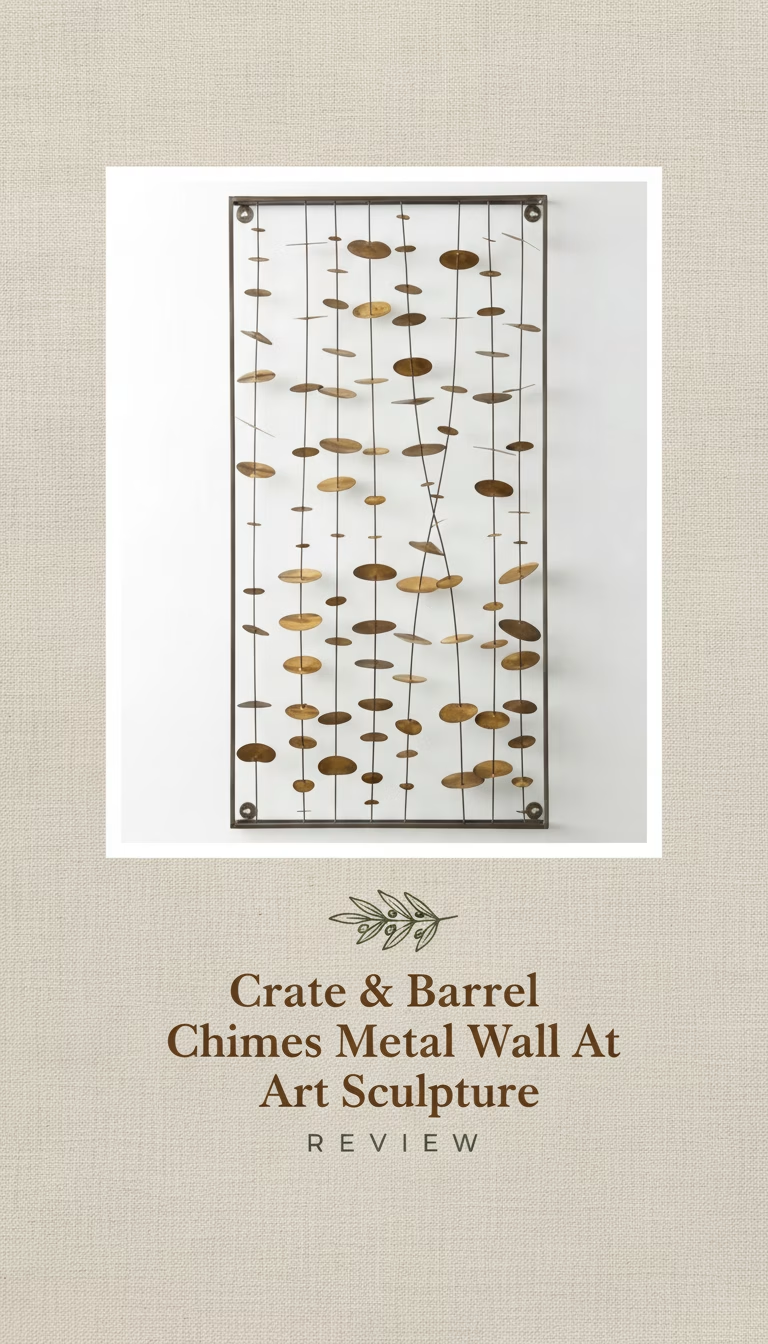
  • Crate & Barrel Chimes Metal Wall Art Sculpture

    Crate & Barrel Chimes Metal Wall Art Sculpture

    Quick Verdict on the Chimes Wall Art

    The abstract design creates a dynamic sense of motion, making it a focal point in any room.
    The quality of the metalwork and the rich finish feels premium, adding…

    Quick Verdict on the Chimes Wall Art

    • The abstract design creates a dynamic sense of motion, making it a focal point in any room.
    • The quality of the metalwork and the rich finish feels premium, adding substantial visual weight to your decor.
    • It arrives well-protected and ready to hang, simplifying the initial setup.
    • Its visual impact relies heavily on ambient or direct lighting; in dimly lit spaces, some of its intricate detail and dynamism can be lost.

    The Crate & Barrel Chimes Metal Wall Art Sculpture is engineered around one idea: bringing kinetic energy and modern abstraction to a static surface. In a market flooded with prints and canvases, this piece offers a different texture and dimension, immediately drawing the eye and inviting closer inspection. It’s not just an image; it’s an object that interacts with its environment, particularly with light. My initial impression, pulling it from its substantial packaging, was how much more substantial it felt than what images convey online. The individual “chimes,” arranged in their undulating pattern, have a heft and a cool touch that speaks to their metallic nature, setting an expectation for a piece that would truly anchor a wall.

    Crate & Barrel Chimes Metal Sculpture — A Meditative Presence on the Wall

    From the moment I unboxed the Crate & Barrel Chimes sculpture, its presence was undeniable. It isn’t a subtle background piece you might eventually notice; it immediately asserts itself as a focal point. My initial encounter involved carefully extricating it from layers of protective foam and corrugated cardboard, a process that felt commensurate with the value of the art itself. The first thing that really got my attention was the interplay of light on its surface even under typical indoor lighting. Each of the individual, elongated metal elements isn’t perfectly flat; they possess a subtle curve, almost like a shallow scoop. This nuance means that as light hits them, it reflects back with varying intensity, creating soft gradients and highlights that give the piece a truly three-dimensional character. It avoids the trap many flat metal artworks fall into, which is appearing rigid and lifeless. Instead, the Chimes sculpture suggests a fluidity, a paused moment of abstract movement. It’s almost as if a gust of wind has caught a collection of elongated reeds, freezing their sway for your admiration.

    I placed it initially on a prominent wall in my living room, opposite a large window. The way it reacted to the natural light throughout the day was fascinating. In the morning, with soft, indirect light, it had a muted, sophisticated shimmer. By midday, as the sun shifted and caught more direct angles, the highlights became sharper, and the shadows it cast on the wall behind it deepened, creating an entirely new layer to the artwork. This dynamic interaction makes the piece feel alive, almost like a silent, ever-changing installation. It’s a testament to the thoughtful design that it offers so much more than a flat visual experience; it’s an evolving conversation with its surroundings. The overall dimensions, substantial at approximately 45 inches wide by 24 inches high, mean it can comfortably fill a significant portion of a wall without overwhelming the space. It commands attention without shouting.

    The Abstract Flow: Deconstructing Its Visual Language

    What sets the Chimes sculpture apart is its masterful use of repetition and variation to evoke a sense of organic motion. The individual “chimes” are not identical; while similar in overall form, their lengths and the subtle angles at which they are arranged differ just enough to prevent monotony. This careful asymmetry is key to its success. If all the elements were uniform and perfectly aligned, the piece would likely fall flat, becoming too predictable and losing its abstract appeal. Instead, the artists have created a rhythm, almost a visual cadence, through these subtle shifts. Some elements appear to jut out slightly more, others recede, and their tips create an uneven, almost jagged silhouette that mimics the irregularity of natural forms. The ends of the metal pieces are cut cleanly, but not with a razor-sharp precision that feels aggressive; they have a refined edge that speaks to quality manufacturing.

    The dark, almost charcoal-grey finish is another critical component of its visual language. It’s not a stark black, nor is it a metallic silver that would reflect too harshly. This muted tone ensures that the texture and form of the metal itself remain the primary focus, rather than an overpowering sheen. It’s a versatile color that blends effortlessly into various decor palettes, from minimalist modern to industrial chic, and even complements warmer, more rustic settings by providing a sophisticated contrast. When observing it up close, I noticed the finish has a very slight texture to it, not completely smooth, which helps to diffuse reflections and enhances its perceived depth. This finish effectively allows the shadows and highlights to do most of the work in defining the piece’s character, giving it a depth that purely flat art struggles to achieve. It feels like a piece that’s been carefully considered not just in its overall composition, but in every small detail of its execution.

    Material Integrity and the Craft Behind the Curves

    The construction of the Crate & Barrel Chimes is robust, immediately conveying a sense of quality and durability. The sculpture is crafted from iron, which lends it a satisfying weight – it’s not flimsy or easily bent, a common complaint with less expensive metal wall art. This heft, while requiring secure mounting, translates directly into a feeling of permanence. When I gently tapped one of the “chimes,” it produced a soft, resonant thud rather than a tinny clang, reinforcing the perception of solid material. The individual elements are welded to a central, hidden frame on the back, and I spent some time inspecting these connection points. The welds are clean, strong, and largely invisible from the front, indicating careful assembly. There were no rough edges or uneven joints that might detract from the piece’s aesthetic. This attention to structural detail is important for an item designed to hang on a wall for years, ensuring it retains its form and integrity.

    The finishing process also stands out. The dark, almost matte, powder-coated finish is applied evenly across all surfaces. This isn’t just paint; it’s a durable coating that resists minor scuffs and fingerprints, making it practical for a decorative item that might occasionally be brushed against or need cleaning. I intentionally ran my hand over a few of the surfaces, and the tactile experience was smooth yet subtly textured, a far cry from the glossy, often plastic-like feel of some mass-produced alternatives. This nuanced finish also plays a role in how light interacts with the sculpture, preventing overly bright, distracting reflections and instead promoting softer, more diffused highlights. It’s a choice that speaks to both aesthetics and longevity, ensuring the sculpture maintains its sophisticated appearance over time without demanding excessive care. For a piece of decorative art, this level of material integrity and craftsmanship is precisely what elevates it beyond mere embellishment to a significant decor statement.

    Installation, Illumination, and Long-Term Presence

    Mounting the Chimes sculpture was surprisingly straightforward, despite its weight. It comes with pre-attached D-ring hangers on the back, strategically placed to ensure balance. I used two robust wall anchors and screws, which felt appropriate for an item weighing in the ballpark of 10-12 pounds (I didn’t have a precise scale for it, but its feel was in that range). The actual hanging process took less than ten minutes once the wall studs were located. What I appreciated was that the hangers are recessed enough that the piece sits relatively flush against the wall, minimizing any awkward gaps. However, because of its three-dimensional nature, it does project about 1.5 to 2 inches from the wall, which is something to consider for high-traffic areas where it might be inadvertently bumped.

    As mentioned, the sculpture’s visual impact is heavily influenced by lighting conditions. To truly appreciate its depth and dynamic qualities, it benefits greatly from either good natural light or thoughtfully placed artificial light. In a room with overhead recessed lighting, the shadows cast by the individual elements can be quite dramatic, adding another layer of visual interest to the wall. However, I did observe that in a corner of my study with lower, more ambient lighting and no direct spotlight, the sculpture tended to recede a bit, losing some of its vibrant interplay of light and shadow. It didn’t look bad, but it simply wasn’t as captivating; some of the intricate layering became less distinct, causing it to appear flatter than it does under optimal illumination. This isn’t a flaw in the product itself, but rather an important consideration for placement. For maintenance, a quick dusting with a microfiber cloth is generally sufficient. The powder-coated finish doesn’t show fingerprints easily, which is a bonus for a piece that might occasionally be touched.

    The Crate & Barrel Chimes Metal Wall Art Sculpture offers a sophisticated, modern accent that transcends simple wall decoration. It’s a piece that demands a thoughtful space to truly shine, particularly one with good lighting to emphasize its dynamic forms and shadow play, but its robust construction and elegant design make it a worthwhile investment for those seeking a sculptural element with genuine presence.

    Pros

    • Looks sophisticated and unique.
    • Surprisingly lightweight for easy hanging.
    • Adds depth without being overwhelming.
    • Great conversation starter piece.

    Cons

    • A bit smaller than imagined.
    • Does not actually produce chime sounds.
    • Might feel pricey for the size.